Wednesday, June 29, 2011

Learning Principles of Design

Here I will do a collaborative entry with a good friend of mine, Joseph Estacion.  We learnt 6 Principles of User Interface Design and 17 applicable Techniques.  For this entry I will talk about 3 principles.  The other 3 will be covered by Joseph at his blog "Apples OS X User Interface".

These are more or less some rules and guidelines we developers and I should heed and adhere to in my future endeavours with designing with new media tools.  Please allow me to share them with you.


The Feedback Principle:
The fourth principle is Feedback.  A user must be notified with a confirmation if there’s a state change that the user requests.   Or if the user deletes items or files, the user interface must concisely and explicitly return a feedback to ensure that the user is fully aware of certain results and that at this point, the action cannot be undone.

I see that iTunes has been able to implement this principle diligently as music or other various contents are important to the user.  Some might have been ripped, bought, or created by the user.  Should there be a command issued by the user, some sort of feedback must be given in response to confirm.  The technique that is applied is number 7: Wording messages and labels effectively.

If a user clicks the "delete" button, a confirmation must always be supplied to ensure that the user is fully aware that they are about make changes that could be potentially disastrous by removing contents that are not only unrecoverable, instead, that it will be lost forever.

In addition, technique number 11 is applicable as well.  A contrast rule must be implemented to ensure the user is able to distinguish each word and character.  The text must stand out from the background.  If the two are analogous, the user will have difficulty reading the feedback provided and finally might make an unsound decision.

The designer should expect the user to make mistakes, technique 13.  The ability to recover deleted items should be provided.


The Tolerance Principle:

The user must be able to undo certain actions when they change their minds.  Therefore the UI must be flexible and tolerant in design.  Having the flexibility in tolerating and reducing the user's possible mistakes by assisting them to autosave their work.  If the ignorance of the user causes havoc, some sort of remedy might be gracefully accepted.  In order for the interface to assist the user in this particular incident, there is an application called "ForeverSave" which lets the user determine the specific application (s) to autosave by user defined set intervals to autosave work and also in variations or state changes, like switching applications.
The technique number 7, wording the messages and labels effectively is imperative as the user must be able to distinguish the specific instructions and to apply the values to activate autosave is required.

In addition, the interface must not be busy.  A clean and straightforward interface where the choices are clearly stated with no distractions.

Obviously, expecting user mistakes must be considered.  If for some reason the user decides to remove certain applications from autosaving, the choice my be provided for the user to remove the application without any issues.


The Reuse Principle:

Certain components and possibly behaviours should have a purpose and be consistent in design and provide easy access and avoid users to relearn the methods.  The MultiTouch interface, for one, is an applicable with consistency technique.  The ability to use the swipe left gesture to go to the next page and vice versa to go back to the previous page.  This consistency is seen in the iPhone, iPads, iPod touches, the trackpad on the mobile computers, and the MagicTrackpad.

Apparently,  technique 6, navigation within screen is enabled as we understand it.  We are then able to scroll up or down from just touch and gesturing down to get to the bottom and vice versa.  Also, to go from one side of the screen to the other side, if we are zoomed into the page we are viewing.


As a result, to zoom in, the Intuitable touch interface provides the user the ability to work things out by basic instinct.  For example,  the "pinch-out" and "pinch-in" gestures could be applied to zoom in and zoom out respectively.  In addition, to turn an image on the computer, a simple left or right turn with the two fingers apart to turn the image into landscape or portrait mode.


So, to continue with the other 3 principles, I encourage you to visit Joseph Estacion's blog entry Apple's OS X User Interface.


Tuesday, June 28, 2011

Big Tooth! (Part 1)


You know the largest tooth of the ocean...I got me one of them...  Well, I made me one...sorta.

I did a little researching on the tooth of the biggest shark ever, that does not exist anymore, called Megalodon (means big tooth in Greek) and lived a long...really long time ago.  It's length spanned to almost 20 meters...yes, that's meters...in length which is approximately 67 feet long.


So, I had the opportunity to make a replica of this.  This is the first part.  So far, I've already spent approximately 6 hours including research.


Prior to starting, I gathered some tools.  This is my very first sculpting.  With only have a block of Super Sculpey clay, I looked around the house to see what I could use to make sculpting tools.  Found some paper clips, metal frame coat hanger, chopsticks, some ties which I collected to tie plants onto support poles...(I didn't know that these came in handy and I was unhappy when the toy manufacturers had to use unlimited ties to strap down a toy in the box it came with).  Anyhow, I also had to build a support base to hold the model up.  With some 2X4's lying in my garage, I used a few screws, to made a very simple but later found it not very sturdy and almost caused a fire...oops...don't tell me wifey... xD.

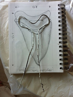
So, this is how I envision what the final product will look like.  I planned for a length of 6 5/8" by 4 3/8 " wide.  After some brief research and look at some photographs, I sketched the front, back, side, and top view briefly.   I know my sketches are really scary and not artistic at all, but I'm not all that concerned.  I just need something to model the replica as a reference.  So, it'll have to do.

Next thing I did was to construct a tool to make the sculpting. I used 2 different sizes of paper clips and using the toy ties that I've been collecting, I wrapped it around the chopstick.


When the basic tool is constructed, I didn't want to take too much fresh aluminium foils to wrap the support frame.  I just recycled newspaper, crumbled them, and wrapped it around the metal frame and shape it as close to the shaped I sketched.


Then I used about two sheets of approximately a little more than a foot each, wrapped the newspaper shaped tooth, and moulded it to look more like the tooth model I sketch and also to hold the newspaper crumbles in place.


At this point, I started to knit and gave the super sculpey clay a massage, flattened it, and wrapped it around the foiled model.  When it was done, the model looked delicious and is ready for an oven.  Does it not look like shwarma...hmmm...now I'm hungry.  Sorry, I got carried away...but I'm still hungry.

The is the front
The rear of the tooth


After some moulding and making the tooth model smooth, it starts to look more in shape.


When the tooth's surface was at an acceptable range, I preheated the oven to 130º C...which ended up being only 130º F instead and this also caused some problems as you will see really soon.  Anyhow, I when the oven was ready, I placed the model into the oven and felt somewhat strange as 130º C does not feel very hot.  While the model was inside the oven, I changed the setting to 275º F and then gave it a few more minutes to bake.

Do you see what the results were for using this 2X4?  It seem this stud was stained and when I opened the oven door, smoke started to emerge from the bottom part of the stud that was resting on the bottom of the oven.  Anyhow, a little excitement and adventure for my tooth modelling.

When the tooth clay model is hardened somewhat, I realized that I forgot to put in the crack that I had in the sketch I made.  So, I quickly craved a crack on the base of the tooth.  It didn't quite turn out as I wanted it to.  Since this endeavour was without prior experience, I didn't know what to do.  I could now mould more clay onto the base of the tooth and make the crack and then bake it again.  However, the support base I used seemed to be stained, although it seemed somewhat pleasant, I don't want the house filled with the aroma of smoked wood studs.  I will have to see if I could make it look better with paint.

On the back of the tooth's base, I poked some holes to give it pores.  Now the next part is going to be painting it...don't know what to expect from that part now.  I hope I don't spill paint all over the place.

Part 2 of this is coming up...access it here.

Sunday, June 26, 2011

Bugs Bunny is a Ninja...actually it's Usagi Yojimbo

I had a new challenge!  

The following is a line art from "NeMAfronSPAiN" on Deviant Art.  He was kind enough to let me use this drawing.  This one is for Nema!  Thanks!

Using the following line art, I placed it in Illustrator and traced the outlines.  As I went along, I have used approximately 20 hours of tracing and adding colour and shadows.

NeMAfronSPAiN's: Usagi Yojimbo

After the first few hours of tracing, it slowly, but surely started to come together.  I traced the ears and head into one layer.  Then the rest of the face in another layer.  Thus, the hands and arms in one and shirt in a separate layer as well.


The legs and shoes also in another layer and the ribbon/rope also another.


Here and in the previous image, I started to play with some colours.  At first, I had the face in plain white or actually, a colour that is off white that has hints of gray in it.  You will find out later that I changed it to something I believe is better.


While I was tracing, I had the original in the back as a reference.  While being zoomed in, I might sometimes see too much detail and would not be able to see what I am actually tracing.  I also had the jpeg file opened so I could compare my trace to the original image without that one being zoomed in.


This part of the feet, legs, and slippers is what took me the longest.  Tracing the part took me at least 3 hours per leg and foot.  I believe I've spent about half of the time on this alone.  I couldn't get it right for a long time.  The tracing part has to be skilfully done so I could have each part replicated as close to the original line art sketch.  The first trace of the legs and feet I had to delete and start from fresh.  It finally started to look right.


With more colours added, the tracing is finally coming together and more animated.  A few more things, like the shadow and a light source would make it look even better.


After filling in some more colours, I noticed that the final product is lacking something.  I added a background colour to it with a light source and it was still lacking.


For the final product, I gave it more character by making the skin a little pale red.  Now it looks fiercely jumping for an attack.  Alternatively, it could be jumping in defence from an attack.  I prefer the latter.  How about you?

Doesn't matter.  Here's my final product and thank you so much, NeMAfronSPAiN!  You're the best!


Tuesday, June 21, 2011

Inspirations from "The Art of Derrick Hodgson"

 The following are done via inspirations of Madreal, Derrick Hodgson.

I noticed that some of the art that Derrick does are long and narrow.  I took that into consideration and made my impressions of them.  It is also easy to doodle as I'm no where near an artist myself.  Hope that it creates an impression on you.

My first batch.

At first, I didn't know what to make out of these impressions.  These just random doodles I made.


The second batch.

The next batch I did was when I noticed Derrick's drawings were long and narrow.  So, that was in my mind for several days and I made long ones.  The Cucumber ones didn't really work out but nevertheless, some of the drawings reminded me of cucumbers.  The Block Totem was my impression of the TOTEM that Derrick created.  I saw my kids' blocks and stacked them on top of each other and took a photo of it.

My impressions of Derrick's TOTEM
The last batch I did was an impression of Derrick's Beaver.  When I showed these to my daughter, she thought of M&M...don't know where that came from.


Next?  Colour them maybe?

Monday, June 20, 2011

Me...revealed.

A new self portrait.  I want to represent myself as a relaxed person.  My shirt is unbuttoned to indicate the state of relaxation.  I am approachable and discuss things over a drink...and food.  At the same time, I'm very serious too.

Friday, June 17, 2011

Need a tyre?

My latest "recreation" of a tyre.  I learnt some key tricks.  The transform "⌘ (command) D"... really nifty trick to repeat the tyre threads.  Nice...and kudos to whoever that discovered that trick.  Here's my traced tyre.
The left tyre is my replica of the original on the right.

Wednesday, June 15, 2011

My Very Own - iPhone 4 review...

I've made an endeavour attempt and daring review of a device that I've been using for a while.  This is my very first review that is documented and shared.  Wow, that is a few first.

The device that was reviewed is the iPhone 4.  I chose to review this device for a very specific reason: it is the only device that sort of know a lot about.  The number one challenge, was to find at least one flaw to report on.  Having used the iPhone 4 for almost a year, I simply found it hard to find at the very least a flaw.  It might have been that I did realize the flaw and adapted to it and/or found a resolution and might have believed that it isn't a flaw anymore.  At the same time, I'm really passionate about the device.  There's not really anything I don't like about the iPhone.  However, when reviewing, I must also point out  the negative or 'cons' of the product.  This was my major challenge.  So I end up reviewing on something that was slightly annoying to me, the virtual keyboard along with it's autocomplete.  Actually, it works like a charm half of the time.  The other half...well, let's just say, I did wish that it would behave as I want it to: "be quiet!"


The title page of the review.

I started the review with an abbreviated company information, history, and products that Apple Inc. currently is producing and marketing.  In this page, I must learn to determine how to layout the images on a page so it is pleasing to and leading the eyes within the page.  Great way for me to apply some of the received information from my Multi Media Design professor.  I do hope that my application of these information are appropriate proportionately correct.


An attempt to page layout.


As I progressed with the hardware configurations and system specifications, I realized that there are a multitude of information available just on the iPhone 4's Apple webpage.  When I reached the third page of these configurations and specifications, I figured that I can't just continue to cover of the rest of the physical attributes of the hardware.  I continued with the firmware or software overview.  While I was reporting on those, another challenge was that there is also countless information available that was not going to be covered.  Choosing what to leave out is also part of this challenge and that wasn't a fun part.  In addition, learning where to draw a line, too.


Learning to leave out more than I need and using smaller images.

Finally, the sources are most probably not referenced correctly.  Unfortunately, when I sent the review to be printed, I realized that there's an upper cap limit of 10 mb for the file to be uploaded for printing at Seneca's computer commons.  My .pdf file was the size of just a bit more than 30 mb.  I wasted some time uploading the file to print while I the file was constantly rejected without any messages.  Then I looked at the FAQ section and that's when I learned about the top cap.  However, when I realized that when I was looking at the review, I realized that none of images were referenced individually.  Bad...bad mistake.  Learnt to have a final check before actually printing the expensive document.


Reference page that is missing details.

Having said all these, this review is a fun report.  I thought it would be an easy review.  The contents were readily available.  The constant tediously attempting the aligning of the images and layout of how it flows along with text is very time consuming.  On and off, I probably have spent about 5 to 6 hours on this project.  Just wish that I'd be able to convert that into cash.  Probably not now.   A learning experience it is.

Wednesday, June 8, 2011

DMA101 - Sports Logo Blog

I did a sports logo for a project with an industry tool, aptly named Adobe Illustrator.  In choosing a logo from a Lacrosse team, the San Jose Stealth, I was challenged with the Pen Tool.  Using the tool was not the challenge.  It is actually what to trace first and how to trace it.  The following is my experience.

First, I traced the target and which I thought was the easiest.  Then, the black background.  As you see there are no issues so far.


Next in line were the letters of the city and team name.  I thought that if I find a font that is close to the actual font family used, type the letters, and then convert the type to outlines and use the Direct Select tool to drag the lines to place.  This is an easy thing to do.  At least, I don't need to do any tracing.  However, it is a very, very tedious step.  Here's a screenshot of the letters for the city of San Jose.


On the next layer was the team's letters.  Unfortunately, I can't recall what the name for any of font family that were chosen.  It didn't matter, because I converted them to lines and aligned them to the reference.  Here's a screenshot of the aligned letters.  This step's tedious index was even higher than the City's letters.  The Team's name Stealth looks like it was chiselled and raised.  I couldn't find fonts that had something similar to it.  I had to trace each aspect that resembled a raised letters with the proper shades.  This tracing part prompted me to think if it was better to start the tracing of all the letters from the beginning and not waste time in searching for a font that closely resembles the actual font used.  Then I had to make sure that the traced "chiselled" and "raised" parts are on top when I filled the letters with the proper colour.   Another tedious process.


The lacrosse stick and the player seemed to have lesser tediousness and no issues as well.  Having said that, I was challenged this time with this logo.  The steps were minute and tedious and at the end, I respect the illustrators who are on this application all day.  In addition, noticing that my classmates are done and already have theirs printed and mounted, I kind of thought that I don't need to worry for this project was a piece of cake.  Unfortunately, I have underestimated that technology depends on having electrical power.  Tonight, there was a thunder storm.  There was a power failure that lasted about 20 minutes.  During those long 20 minutes, with the tiring repeated steps that are required, I became worried if I could complete this in time for submission.   After much worry, I finally completed the project.  Here's the final.


Thursday, June 2, 2011

Scariest Paintings ever... No...really.

I am warning you.  These paintings are very, veeerrrry and reeeaaaaaally scary.  Proceed at your own risk.

Okay, consider yourself warned.

The following are my very first painting as far as I could remember.  Just figured I'd share them.  That's all.

No smart@$$ed comments or jokes, ok...?  Actually, yea, please send me those comments.  I kinda need discouragements.


This is supposed to be Darth Maul.
Um... a bug...I think....actually, yes, a bug.  Not a spider.


No idea, huh?  Matrix fans anyone?

Yup...you guessed right, a Dragon...and, uh, if you'd just understand Chinese, smaller than Bruce Lee.

I thought I'd end the session with a happy one.